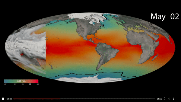
Visualizations enable us to detect patterns and trends in complex data sets, that might not be obvious by looking at the raw data alone. The visual exploration process often requires comparisons between multiple visualizations, either from the same dataset (E.g. different variables) or a different one, to identify relationships and compare patterns. The existing tools that facilitate visual comparisons do this by three means: Juxtaposition (placing visuals side-by-side), Superposition (overlaying visuals) and Explicit Encoding (visualizing a derived quantity corresponding to the relationship being studied). While superposition is ideal for geospatial datasets, where spatialization is a key component of the data, the spatio-temporal nature of atmospheric science data presents a challenge with comparative visualizations. The Visual Comparator presented here is a cross-platform application (Desktop, Kiosk and Web) that could be used to superimpose and compare upto three synchronized, animated visualizations and enable the viewer to transit between the visualizations using a slider. This form of visualization has the advantage of drawing the viewer’s attention to changes between the datasets, enabling comparisons of scale and reducing the clutter caused by having multiple variables in one visual.